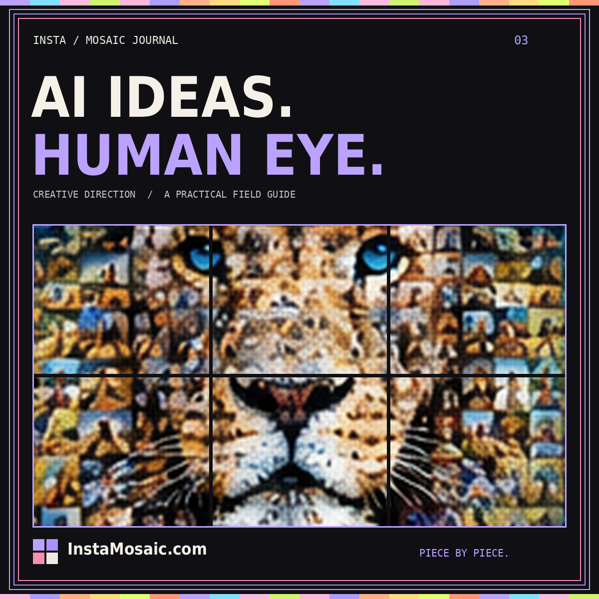
An AI mosaic can begin with a sentence, but a finished piece needs more than an interesting prompt. You still have to decide what belongs in the image, whether the tiles should represent real photographs, and which parts of the composition must remain under precise control. Generating an attractive texture is not the same task as arranging a meaningful collection of memories.
The most useful approach is to separate exploration from assembly. Use AI where variation helps: trying a mood, imagining a material, or testing a composition. Use deliberate editing where accuracy matters: real people, exact text, recognizable photographs, and final dimensions. This guide offers a practical art-direction workflow rather than a promise that one prompt will reliably solve every stage.
Name the kind of AI mosaic you are making
The phrase AI mosaic can describe several different things. A generated illustration may look as though it is made from ceramic tiles, torn paper, or hundreds of tiny pictures. An AI-assisted collage may combine selected photographs with generated backgrounds. A photographic mosaic may use a matching process to arrange real tile images into a larger target. Those outputs are related visually but not interchangeable.
Write a one-sentence brief before opening a tool. For example: create a geometric botanical poster with a tiled texture and space for a title. That is a different assignment from building a family portrait out of approved family photographs. In the second case, preserving the actual input photographs matters more than creating plausible-looking miniature images. Our mosaic versus collage guide explains the structural differences.
Separate your fixed requirements from your experiments
List what cannot change: the subject, the approved photographs, the wording, the canvas ratio, and any required colors. Then list what you are willing to explore: tile shape, lighting, background texture, or the balance of positive and negative space. This prevents a visually exciting generation from quietly replacing the purpose of the project.
For a birthday composition, the fixed requirements might be a particular name and a small set of real memories. The experimental part could be the border and surrounding paper textures. For an abstract art mosaic, almost everything except the format and color family may be open. A clear boundary between fixed and flexible elements makes the review process much easier.
Write prompts like a visual brief
Describe subject, arrangement, material, palette, and empty space. A useful exploratory prompt might ask for an abstract flower built from irregular paper tiles, with a limited violet and coral palette, a dark background, and a quiet upper-left area for typography. These instructions communicate relationships rather than relying on a long stack of adjectives such as stunning, perfect, and professional.
Generate a small set of alternatives and compare their structures. Does one have a clearer focal point? Does another use tile size more expressively? Save the directions that are useful even when the details are imperfect. Avoid changing the entire brief after every output. Change one major instruction at a time so you can learn which decisions are shaping the result.
Use references to guide composition, not guarantee identity
When a tool accepts reference images, determine what the reference controls. A style reference may guide the overall look, while a composition reference may guide the arrangement of shapes. Adobe Firefly's composition-reference documentation describes matching structure through outline and depth, with a strength control for adherence. That is guidance about composition, not a guarantee that every person, word, or tiny image will be reproduced exactly.
Prepare a simple reference that shows the layout you need. A rough arrangement of rectangles can be more useful than a fully finished picture with many competing details. Keep references that you have permission to use. For sensitive or personal images, examine the chosen service's handling of uploads before sending a file. The creative benefit should be weighed against the information the image contains.
Keep real memories out of the guessing stage
If a project depends on actual photographs, place those photographs directly in the final layout rather than assuming generated tiles are faithful copies. A decorative image can suggest a field of memories without containing the original moments. That may be appropriate for concept art, but it is not a substitute for a photo mosaic whose meaning comes from specific people and events.
A practical hybrid workflow is to generate an abstract frame or background, then assemble the approved images in a conventional editor. Use masks, crop controls, and separate layers to preserve flexibility. This gives AI a clear supporting role. The final composition can feel imaginative while the photographs that matter remain recognizable and traceable to the files you selected.
Add exact typography after the image direction is settled
Treat names, dates, and short headlines as a separate design layer whenever precision is important. Set the text in an editor where you can check spelling, line breaks, spacing, and contrast directly. A beautiful image loses credibility when its most important word is wrong or a small letterform becomes ambiguous at social-preview size.
Reserve text space early, but do not lock the final type treatment before you know how busy the image will be. Try a solid panel, a quiet margin, or a restrained block of negative space. Give the headline enough room to breathe. Our art mosaic color guide explores the balance between expressive palettes and readable lettering.
Review generated details with a specific checklist
Inspect the focal subject first. Look for unclear anatomy, unintended facial changes, mismatched perspective, and elements that imply a different story from the brief. Then examine repeated objects and small tiles. Are the repetitions intentional, or do they create a distracting pattern? Finally, scan the edges for accidental marks, clipped features, and shapes that resemble unwanted text.
Do not correct everything by generating again from scratch. Some issues are better solved with a crop, a mask, or a simpler background. Keep the strongest structural version and repair local problems where your editor permits it. Save versions before major edits so that an attempted improvement does not erase a composition that was already working.
Make the handoff between tools deliberate
An AI image, a layered collage project, and a finished export are different assets. Store them separately and use descriptive filenames. Keep the prompt or brief beside the exploratory outputs so you can reproduce the direction later, even when exact regeneration is not possible. Record which source photographs were approved for the final piece.
When moving between an AI collage app and a desktop editor, confirm dimensions and transparency before doing detailed placement. Avoid repeatedly exporting a small compressed preview and then enlarging it. Build the final layout at the intended size whenever practical. The desktop workflow guide explains why editable project files and plain image exports should both be part of the handoff.
Present the work according to what it actually is
A generated mosaic-style illustration should not be described as a documentary collection of real photographs when it is not. A hybrid artwork can be described as a mixed-media collage or a digitally composed mosaic, depending on what you made. Choose language that helps the viewer understand the work rather than inflating the capabilities of the tool.
For commissioned or collaborative projects, agree on the role of AI before the final review. Clarify which parts are generated, which are supplied photographs, and what level of revision is included. That conversation is especially useful when people expect their identities, products, or personal memories to remain unchanged. Honest scope makes creative experimentation easier, not harder.
Finish with an editor's eye
The useful question is not whether AI made the image quickly. It is whether the final piece expresses the idea clearly, respects the source material, and survives inspection at its intended size. Use generation to widen the range of possibilities, then narrow that range with deliberate choices. A strong AI mosaic still benefits from restraint, a clear focal point, and a human decision about what the viewer should notice first.